Responsible ML Workflow summary
I recently came across this paper on LinkedIn, which I thought was a particularly valuable source, both in itself and for further reading. I enjoyed reading it and learned a lot of new things, made a summary for myself and figured I would share it.
You can find the paper here and it’s about responsible machine learning (ML), obviously, a subject that is very close to my heart. It has suggestions for how one can go about it practically along with an example case study, and focuses mainly on (as the title says) interpretable models, post-hoc explanations and discrimination testing. All figures in this post are taken directly from the paper.
The area of responsible AI is gaining more and more traction and attention. I think this is a very good thing. In this post I will not try to convince you why it is important or how important it is, I will merely say that the application of AI/ML brings with it the potential for large risks in the areas of discrimination, privacy, transparency and security, and assume that the interested reader is indeed interested for precisely those reasons.
As the authors note, the field is amorphous and vague and despite the increase in written and spoken communication and material about it, the practical application of responsible AI seems to be fraught with uncertainty. The authors express they hope this paper helps give practical handholds, and I am inclined to say that they succeeded in that.
I’ll start with the flowchart from the paper depicting an example responsible ML workflow. None of it should come as a surprise, and I won’t go into much detail about this chart, but it is a very valuable chart because it is complicated to take care of this entire flow well, and easy to lose sight of when you are in the trenches of development.
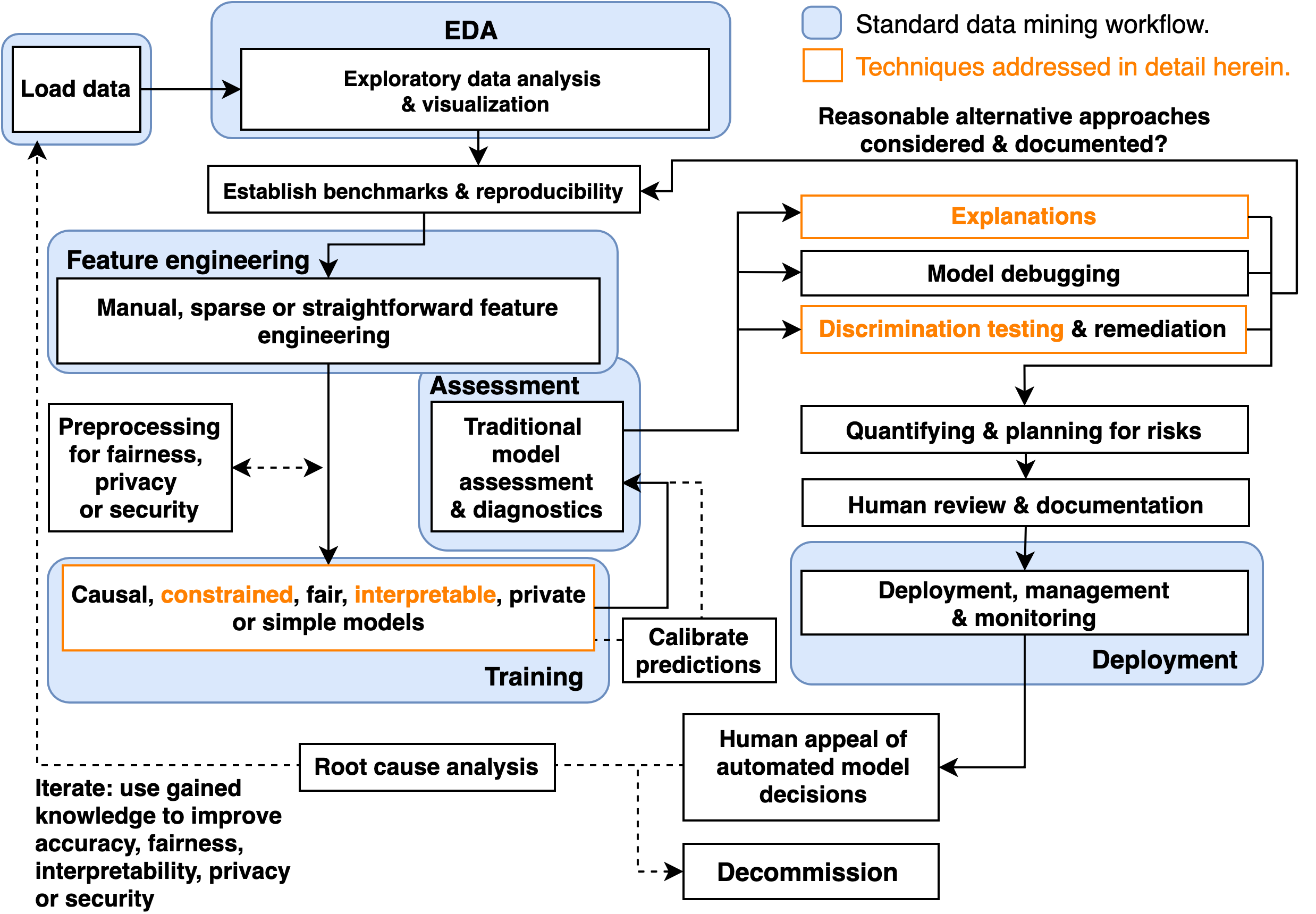
The paper focuses, as said in the title, on the orange boxes. It does so in the order indicated by the flow, and uses both a simulated dataset with known properties, and the HMDA mortgage dataset.
Constrained and interpretable models
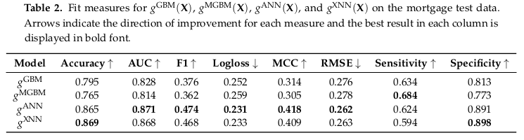
Step 1: to prevent undesirable behaviour from black-box models, simply make the box less dark. We know that throwing XGBoost or autoML at a problem is likely to give us the best accuracy vs coding effort trade-off, but the authors show that at least for these two datasets using uninterpretable models does not offer convincing accuracy benefits. They show this using the following models:
- an unconstrained gradient boosting machine (GBM) and a monotonically constrained GBM (MGBM). An MGBM simply put just makes sure that the function that represents a single tree is always a monotonic function with regard to the tree’s input.
- a ‘normal’ artificial neural network (ANN) and an explainable neural network (XNN). The output of an XNN is essentially a linear combination of K functions, where each function k has one input and one output, and the input is a linear combination of features. Each function k is itself also a neural network, but I repeat it’s 1-d function, so the purpose is to be able for each subnetwork (function k) to have the freedom to become a suitable simple analytic function. It’s trained with large L1 regularization so that the input linear combinations for the functions k consist of only a few significant contributors.
The tables of fit results for both the simulated data and the mortgage data are below, but the short story is that the MGBM is at most 3.5% worse than the GBM, and the XNN at most 1% worse and in some cases actually a little better than the generic ANN.
So far we’ve claimed that these constrained models were more interpretable mostly by saying that the resulting learned functions are less complex. This sounds plausible, but let’s eat the pudding and see if we actually like it.
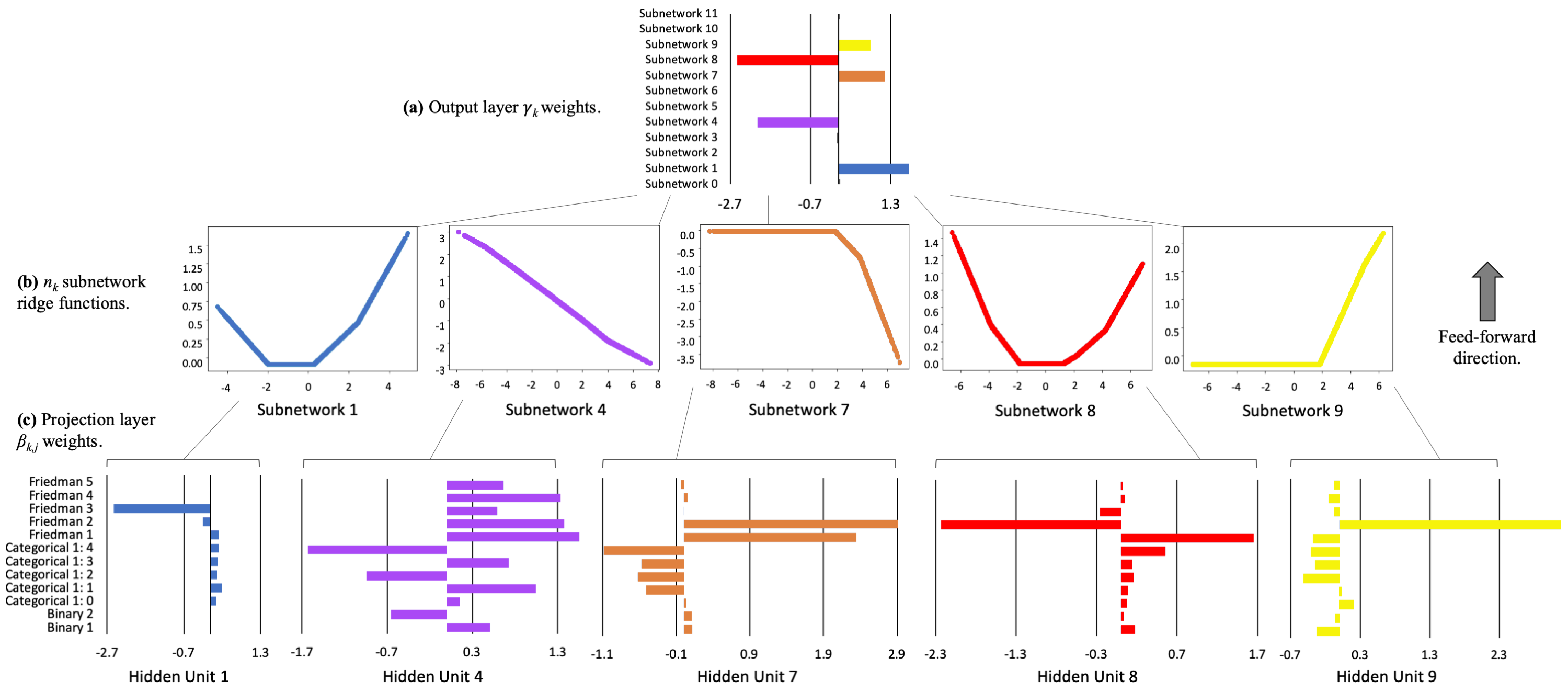
This is the interpretability view of the XNN trained on the simulated dataset. On top are the weights in the output layer of each subnetwork, bigger weights indicate more important functions. Then, in the middle, are the most important actual subnetwork functions. Note that this is an exact representation, each function has 1 input and 1 output. And on the bottom, for each subnetwork, the input weights for the linear combination of features.
Now, I’m showing you the model trained on the simulated dataset, because then we can check these interpretability results against a known ground truth analytical function. That function is:
 and the authors added 2 binary features and 1 categorical feature to that. So we can see in the figure that subnetwork 1 has learned to represent the square of feature 3, subnetwork 4 has successfully learned the correct relative contributions of features 4 and 5, and subnetworks 7, 8 and 9 together approximate the sine of features 1 and 2. So yes, I think this is a nice and accurate way to try to interpret this model.
Of course, we cannot make a plot like this for the MGBM, the paper uses Partial Dependency (PD) and Individual Conditional Expectation (ICE) plots instead. If we’re talking about “explanation” vs “interpretation”, I think PD’s and ICE’s are a bit ambiguous in that regard. You have to use data to create them, just like post-hoc explanations, but you don’t use PD’s and ICE’s to check individual predictions, you use them to interpret what your model is doing. So let’s keep them in this section then. What are PD’s and ICE’s?
Conceptually PD’s are pretty straightforward, you just marginalize over all but one input features so you get the 1-dimensional behaviour of your model with respect to that one unmarginalized variable. Put another way, you take your dataset and set your chosen feature to some fixed value, the same value for each datapoint, and apply your learned model to this change dataset, and take the average of the output. Repeat for a bunch of values for the chosen feature, and you have the 1-dimensional plot as function of the chosen feature.
PD’s have problems if there are strong correlations or interactions (as you may be able to imagine), so you can never use them on their own. This is where the ICE’s come in. You are going to plot the ICE in the same graph as the PD, because both of them map a value of the chosen input feature to the model output. However, 1 ICE only applies to 1 datapoint, and you just change the value of your chosen input feature for that 1 data point and see how the output changes. Now, what is the added value of plotting 1 data point like this? None. The trick is to take a number of individual data points and their ICE, and you pick them in such a way that you sample the output space of the model. Below, you can see a example from the paper, they pick 10 data points along the percentiles of the output.
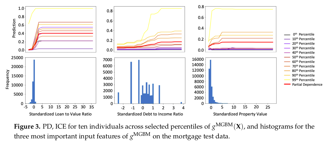
In plots like this, you can observe the general behaviour of your model as a function of a single parameter. This is nice and interpretable, if both PD and ICE’s are well behaved. If they are not, i.e. the PD and ICE curves diverge, that is a sign that you have strong correlations or interactions, and apparently fluctuating ICE’s can also be a sign of overfitting or leakage from strongly non-monotonic signals in constrained features into non-constrained features. Lastly, it is informative to put the distribution of the feature values in a histogram below the PD/ICE plot, so that you can check the behaviour of the model in sparse regions.
I like this method as well, it contains a lot of information in a single view that is still pretty straightforward to read. So we see that having an interpretable model comes down to constraining the space of allowed functions coupled to a suitably understandable view. You cannot have an interpretable view without a constrained model, and a constrained model without a suitable view is not interpretable.
It may seem very restricting, but I like to remember this paragraph from Goodfellow, Shlens & Szegedy (2015):
“[…] LSTMs (Hochreiter &Schmidhuber, 1997), ReLUs (Jarrett et al., 2009; Glorot et al., 2011), and maxout networks (Goodfellow et al., 2013c) are all intentionally designed to behave in very linear ways, so that they are easier to optimize. More nonlinear models such as sigmoid networks are carefully tuned to spend most of their time in the non-saturating, more linear regime for the same reason. […]”
Post-hoc explanations
Step 2: so you think you know what your model is doing, let’s check that with global and local explanations. Also, this can be a feature that is nice, useful or even required for your users (for appeal and redress f.e.). The authors go all-in on Shapley values for their post-hoc explanations instead of, for example, LIME, because they are apparently the only known locally accurate and globally consistent explanations. What that means is that a) the individual explanation values per feature for an individual explanation always sum to the actual model output and b) that explanation values change in the correct direction when the model changes.
Conceptually and theoretically, the explanation values are computed by taking all possible subsets of input features, and for feature j check the difference of the model output between each pair of subsets that only differ by inclusion/exclusion of j. I don’t know about you, but although this makes sense to me on an abstract level, on a practical level I don’t really have a feel for it yet (unlike LIME, which is very intuitive to me, but suffers from some downsides - probably good for a whole separate blog post). In practice however, you need more tractable algorithms to compute Shapley values (which are supplied in many packages) that I don’t know anything about yet.
Point is, you can easily compute SHAP (Shapley Additive Explanations) nowadays for your models, and you should. Apart from providing them to your users, you can check your global SHAP values (in general the mean of all local explanations over your dataset) and some individual datapoints to check consistency with your domain knowledge. If you pick your individuals along the percentile axis of the model output, you should be able to check that SHAP values change in a consistent manner, like in the plot from the paper below.
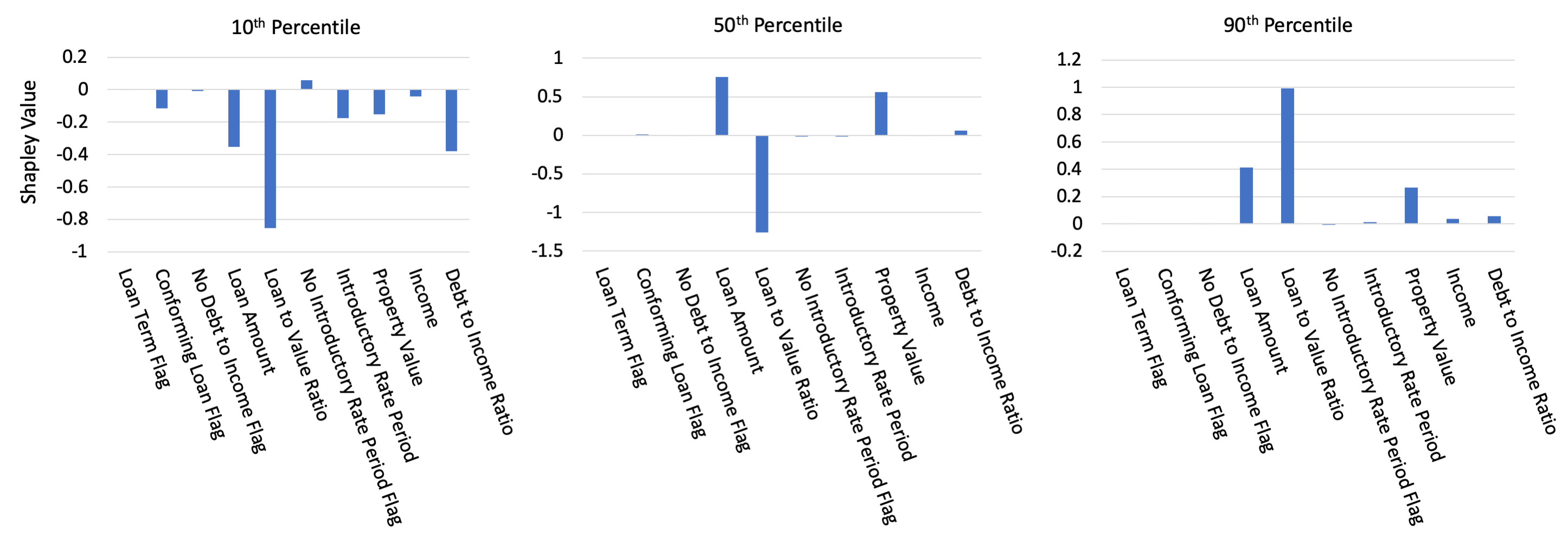
Post-hoc explanations are important for transparency, trust and providing impacted individuals an opportunity for appeal. For the people developing the models, post-hoc explanations provide important redundancy (together with the interpretable models) for checking that the model is sensible. Regarding the latter, I think I would like more though. We’re effectively checking consistency with domain knowledge either at an overall level, or by spot-checking. But (let’s just consider SHAP only at the moment) I can imagine looking at distributions of Shapley values over the dataset (and by sub-groups) and doing statistics on them. I expect that should allow you to find smaller inconsistencies or peculiarities. Besides SHAP of course, there are many other ways of doing things that are similar to post-hoc explanations, which is a subject outside of the scope of this paper and this blog, but I hope I’ll get around to researching them and writing a dedicated blog about them at some point.
Discrimination Testing
Step 3: don’t be evil. I don’t think I have to explain why it’s important to not discriminate. So why is it so easy to find examples of algorithms that discriminate? Well, I’m not going to burn my hands on trying to give an exhaustive answer, but two components of an answer may be that a) there are so many different mechanisms by which bias can enter your dataset or your model that it’s difficult to keep an eye on all of them and b) even if you think you took the necessary precautions, all correlations and causal effects are biases (the only difference between bias and signal is in the interpretation), and algorithms are designed to find them, so they may find a way around your precautions. Therefore, you should check afterwards.
There are a lot of different measures of bias and discrimination (also known as Disparate Impact, DI). Many of them are mathematically incompatible, meaning it will be fundamentally impossible to create something that is ‘fair’ according the every definition of ‘fairness’. So picking which measures are the ones that count is a political matter and depends on the particulars, but the least we can do is measure the measures and report them. The authors employ a limited number of measures that are well established in regulatory and legal standards in the US.
- Marginal Effect (ME): difference in percentage of members of subgroups receiving a favourable outcome. \[Pr(y=1|male)-Pr(y=1|female)\]
- Adverse Impact Ratio (AIR), aka relative risk: ratio of percentage of members of subgroups receiving a favourable outcome. Values that are statistically significant and below 0.8 are typically considered evidence of discrimination. \[Pr(y=1|female)/Pr(y=1|male)\]
- Standardized Mean Difference (SMD), aka Cohen’s d: for continuous variables. Average outcome for protected class minus average outcome for control class, all divided by a some measure of the standard deviation of the (sub)population. Effects are considered small, medium or large when values exceed 0.2, 0.5 and 0.8. Because of the normalization, it becomes possible to compare between outcomes.
A useful term to apply to discrimination testing is practical significance, which is the case when a measure is both statistically significantly non-parity and the measure crosses some chosen threshold. This threshold acknowledges the fact that in any large enough dataset, statistically significant but meaningless measurements of non-parity will show up from time to time as a matter of course.
Common thresholds are already mentioned above, while the common standard in regulatory context for statistical significance has become the 5% two-sided test (or 2.5% one-sided). In the table below, the AIR regarding race for both XNN and MGBM models are below the threshold of 0.8 (and also statistically significantly so - not shown) and in should warrant investigation into the cause and validity of the disparity, and application of remediation techniques.
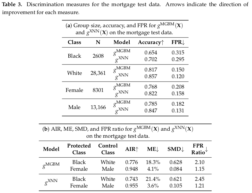
The authors also report accuracies and FPR’s per subgroup and FPR ratio. Their results already contains an example of a dilemma. If, as a model developer, you have to chose between two models, and one model gives lower FPR for the protected class, but the other model gives you lower FPR ratio, then which is the more fair model?
This is one of the reasons why post-hoc explanations for users are extra important. A single objective fairness measure does not exist, so it becomes essential that individuals get a transparent opportunity for appeal, override or redress.
Specifics of remediation in practice are outside of the scope of the paper and we are referred to this paper, for this topic is a large body of work in its own right. Roughly speaking, we can divide the strategies in two categories: across-algorithm (algorithm search) and within-algorithm (auxiliary loss function, f.e.) approaches. Both approaches are becoming more feasible and effective with the enhancement in computing resources. Which specific remediation is suitable will depend on the specific case, but it is discussed that in general approaches that do not need to use class information are more likely to be acceptable in highly regulated settings. What I find interesting here is the implication that you can now perform a search over an increasingly large space of algorithms to optimize for accuracy and non-discrimination simultaneously, although this requires that hold-out validation should be done with even greater care than before.
Lastly
Okay, let’s wrap it up. I think we’ve talked about the most important things in this paper for the community as a whole (in my opinion); a practical example of a responsible ML workflow. This is not the end of course and for that reason I do recommend that you read the paper yourself, there’s a lot of material and references in there to keep you busy. Among other things technical details and discussion of nuances of the different techniques, and discussion of policy and protocol. In addition their source code is available at https://github.com/h2oai/article-information-2019.
I think the workflow described in this paper, and the techniques showcased are very valuable, and also quite practical to use, so use them we should. Personally, going forward, I think I would like to see more statistical analyses, like bootstrapped distributions and explicit hypothesis evaluations (and I’m not simply talking about p-values of course). Because every dataset is just a single instantiation of the truth (kinda), no matter how large it is, I expect that may help in interpreting results and informing decisions based on them.
Finally, the authors provide a very nice list of packages and references to do various Responsible Data Science tasks, which I think is valuable enough to just copy-paste here (links go to the packages, for literature see the references in the paper, or follow links from the package sites):
Interpretable models, interpretability:
- evaluate EBM (Explainable Boosting Machine https://www.microsoft.com/en-us/research/wp-content/uploads/2017/06/KDD2015FinalDraftIntelligibleModels4HealthCare_igt143e-caruanaA.pdf): interpret package [https://github.com/interpretml/interpret]
- optimal sparse decision trees: OSDT package [https://github.com/xiyanghu/OSDT]
- GAMs: pyGAM package [https://pygam.readthedocs.io/en/latest/]
- a variant of Friedman’s RuleFit: skope-rules package [https://github.com/scikit-learn-contrib/skope-rules]
- monotonic calibrated interpolated lookup tables: tensorflow/lattice [https://github.com/tensorflow/lattice]
- this looks like that interpretable deep learning: ProtoPNet [https://github.com/cfchen-duke/ProtoPNet].
Further tasks:
- Exploratory data analysis (EDA): H2OAggregatorEstimator in h2o [http://docs.h2o.ai/h2o/latest-stable/h2o-py/docs/intro.html].
- Sparse feature extraction: H2OGeneralizedLowRankEstimator in h2o.
- Preprocessing and models for privacy: diffprivlib [https://pypi.org/project/diffprivlib/], tensorflow/privacy [https://github.com/tensorflow/privacy].
- Causal inference and probabilistic programming: dowhy [https://github.com/microsoft/dowhy], PyMC3 [https://docs.pymc.io/].
- Post-hoc explanation: structured data explanations with alibi [https://pypi.org/project/alibi/] and PDPbox [https://github.com/SauceCat/PDPbox], image classification explanations with DeepExplain [https://github.com/marcoancona/DeepExplain], and natural language explanations with allennlp [https://github.com/allenai/allennlp].
- Discrimination testing: aequitas [https://github.com/dssg/aequitas], Themis [https://github.com/LASER-UMASS/Themis].
- Discrimination remediation: Reweighing, adversarial de-biasing, learning fair representations, and reject option classification with AIF360 [https://github.com/IBM/AIF360].
- Model debugging: foolbox [https://foolbox.readthedocs.io/en/stable/], SALib [https://salib.readthedocs.io/en/latest/], tensorflow/cleverhans [https://github.com/tensorflow/cleverhans], and tensorflow/model-analysis [https://github.com/tensorflow/model-analysis].
- Model documentation: models cards (paper, not a package: [https://arxiv.org/pdf/1810.03993.pdf]), e.g., GPT-2 model card [https://github.com/openai/gpt-2/blob/master/model_card.md], Object Detection model card [https://modelcards.withgoogle.com/object-detection]